
Paintinh in Photoshop is the simulation of natural media is always a tricky prospect when working digitally. There are endless filters and niche applications out there that promise convincing results. However, quick fixes and prefab effects often are disappointing . When you are painting digitally, the old saying “ If you want something done right, do it yourself ” comes to mind, and this is exactly what you’ll learn to do in this chapter . Photoshop may not be the first application that you think of when you’re setting out to paint. However, a closer look at what Photoshop has to offer in terms of paint tools will reveal that everything you need is there. The tools and features at your disposal are a bottomless pit of options and flexibility. There is a little something in there to suit any user or simulate almost any artistic style.
You’ll need a very basic understanding of the Layers palette and Photoshop’s paint tools. You don’t need to know anything about image editing tools or selection tools or anything like that. We are simply discussing the act of painting digitally in a methodical way .
PART ONE: Getting ready to paint
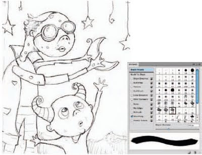
Open up the sketch.jpg file. Starting with a sketch is an essential part of the process when painting in the tactile realm, and working in Photoshop is no exception. The main difference here is that in this case the sketch is scanned rather than being drawn directly onto the canvas. Once you’ve opened up the sketch, select the Brush tool. In the Brushes palette, enable the Smoothing option at the left. We’re going to work with this option enabled for the entire chapter because smoothing guarantees that your brush strokes contain nice, smooth curves. And that is an essential quality when you want your painting to look convincing.
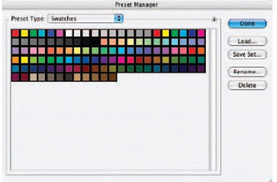
Now, the next thing we’re going to do is establish the Swatches palette as our paint palette and fill it with our own set of colors unique to this painting. By doing this, we can return to the Swatches palette and select one of our custom colors at any point later on. Choose Edit Preset Manager from the menu. Choose Swatches from the Preset Type menu. The Preset Manager can also be accessed via the Swatches Palette menu. If you access it via the Swatches Palette menu, the Preset Type is automatically set to Swatches. When the swatches appear, click on the first swatch and then Shift-click on the last swatch. This will target all of the swatches. When all of the swatches are targeted, click on the Delete button. After they’re all deleted, click on the Done button to exit the Preset Manager, and you’ll notice that the Swatches palette has been emptied.
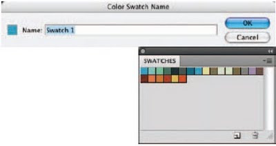
When the Swatches palette is empty, click on the Foreground Color swatch in the toolbox to access the picker. Select a new foreground color from the picker and click OK. Move the mouse over the empty area of the Swatches palette. You’ll see it temporarily switch to a paint bucket. When you see the paint bucket, click to add the new color to the Swatches palette. Name your new swatch when prompted and then click OK. After naming, the new color is added to the Swatches palette. Use this method to add a variety of colors to the Swatches palette. This method is an excellent way to exercise a little forethought, establishing a predefined color scheme to work within before you begin painting.
After selecting the Brush tool, choose the largest Chalk Brush preset from the Brushes palette. In the Brush Tip Shape section of the Brushes palette, increase the diameter of the brush. You want a large brush here because, first, we want to cover most of the background with color, giving us a new base color other than white. Leave the spacing option enabled but reduce the amount to 1 so that there is no stepping or spaced brush marks present within your strokes. Choose a foreground color from the Swatches palette and click the Create a New Layer button in the Layers palette.
PART TWO:The background and figure outlines
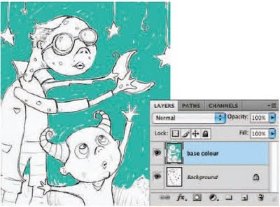
Target your new layer in the Layers palette and begin to paint a series of strokes on the new layer. Focus on areas that are the background, as indicated in the sketch. Just start painting some strokes; don’t cover the line work of the sketch on the underlying layer; and allow a little white to show through between strokes here and there. Also, increase and decrease the brush diameter in the Brushes palette to accommodate different regions on the canvas. For open areas of the background, use a brush of very large diameter; for tighter regions, such as between the small figure’s fingers, use a brush of much smaller diameter.
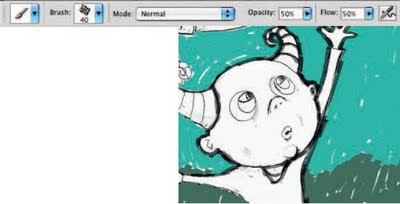
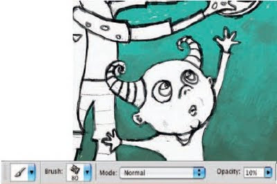
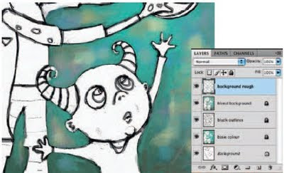
Choose a different color from either the picker or one of your own custom swatches and paint the background area at the bottom of the canvas. When you’re finished, choose a black foreground color and create a new layer in the Layers palette. Target the new layer and use the brush to begin tracing the black outlines of the underlying sketch on this new layer. Reduce the opacity of your brush in the Tool Options bar to 50% so that there is a translucent effect as you paint small strokes over the top of each other.
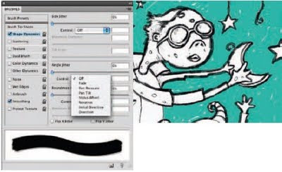
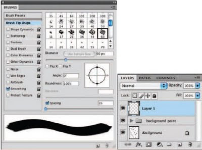
Click on the Brush Tip Shape option from the left in the Brushes palette. Use this area often to vary the angle of the brush as you paint. You’ll need to tweak the angle frequently when painting around areas such as the heads of these creatures. If you don’t adjust the angle at times, there will be areas where the strokes appear too thin compared to others. Click on Shape Dynamics in the Brushes palette to enable Shape Dynamics and then on the Angle Jitter Control menu to view the options.
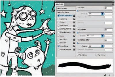
Choose the Direction option from the Control menu, but leave the angle jitter amount set to 0. This setting causes your brush to base the angle of the brush tip on the directions of your stroke as you paint them. Because we still want a somewhat smooth edge to the strokes, the amount is set to 0. The more you increase the amount, the rougher the edges of the strokes will appear. By simply enabling the Shape Dynamic function, you can save yourself the trouble of having to constantly adjust the angle as you paint. Finish painting the black outline.
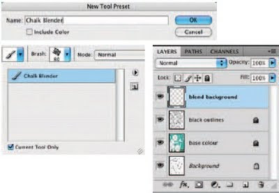
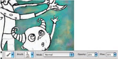
Reduce the opacity of your brush to 25% and then open the Tool Preset picker at the far left of the Tool Options bar. Click on the Create New Tool Preset button. When you are prompted, name the tool “ Chalk Blender. ” Disable the Include Color option and click OK. This brush is now added to the preset picker, with all of the Brushes palette options and dynamic functions intact. You can access it directly from the preset picker from now on. Create a new layer in the Layers palette and ensure that it is targeted.
Use your current brush, set to 25% opacity, to blend the background fill colors together on the new layer; this is precisely why we named the preset “ Chalk Blender. ” Start by painting strokes over the areas where light and dark colors meet. Paint dark strokes over light areas, and vice versa. Go back and forth painting like this until colors begin to blend together. Change the direction of your brush strokes often as well as the size of your brush tip. Also, if using an opacity of 25% does not give you a blend effect that is as smooth as you’d like, try reducing it when necessary.
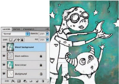
Now add different colors from the Swatches palette into the background here and there, using the same brush on the current layer. Try initially adding them using a higher brush opacity setting, and then blending them into the background using lower opacity settings. A quick way to work is to Alt(PC)/Option(Mac)-click on areas of the canvas to sample color rather than always returning to the Swatches palette. This technique is especially useful when blending as you can sample “ in-between ” colors. Using this method, if you happen to sample a foreground color that you like, feel free to add it to the Swatches palette so that you can access it later.
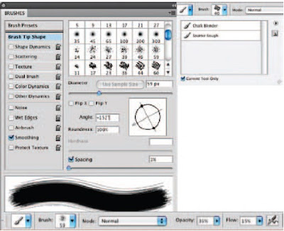
In the Brush presets section of the Brushes palette, select the spatter 59 pixels Brush Tip preset. Now, in the Brush Tip Shape section of the Brushes palette, adjust the angle of the brush tip until you’ve achieved the roughest looking stroke possible. In the Tool Options bar, set the opacity of the brush to 35% and the flow value to 15%. Save this new brush as a tool preset and name it Spatter Rough.
Create a new layer and use your newly created tool preset to paint over areas of the canvas on this layer. Increase or decrease the opacity as required and use colors from the canvas or the Swatches palette. The goal here is to paint with the new brush over areas that look very smooth. Because of the brush tip and very low flow setting, the resulting strokes will add a rougher, more textured feeling to the areas you paint. Using large brush strokes and bold colors will pronounce the rough effect. Use this effect sparingly as it can tend to overpower an illustration.
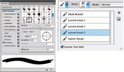
Open up the brush1.jpg file. Choose Edit Define Brush preset from the menu. Name your brush and return to the working file. Choose your new custom brush tip from the end of the list in the Brush Presets section of the Brushes palette. In the Brush Tip Shape section of the Brushes palette, set the spacing to 1. In the Tool Options bar, set the opacity to 50% and the flow to 15%. Save this brush as a new tool preset. Use this same method to open up brush2.jpg and brush3.jpg and save them as new tool presets, using the same spacing, opacity, and flow settings.
Now that you have added three new custom brushes and a new dual brush to the Tool Preset picker, use them to paint some rough strokes on this layer. Just because the presets contain embedded settings for opacity and flow, that doesn’t mean that you can’t change them each time you use them. Use a variety of colors, brush sizes, opacity, and flow settings to introduce some very real and tactile feeling brush strokes on the current layer. Again, ensure that you do not overdo it as these new brushes, which produce such distinct strokes, can visually overpower the softly blended background quite easily.
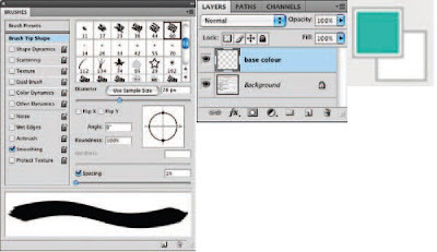
When you’re finished, target the top layer and then Shift-click on the layer directly above the background layer in the Layers palette. This will target all of your paint layers. Choose Layer>New>Group From Layers from the menu to add them to a group. Because we’re going to start painting the other image components, this grouping of layers will help us keep things separate and organized. Create a new layer for the base color of the figures. In the Brushes palette, choose one of the default chalk brush tip presets. Ensure that Smoothing is enabled, and in the Brush Tip Shape section of the palette, reduce the spacing amount to 1.
PART THREE: Painting the figures
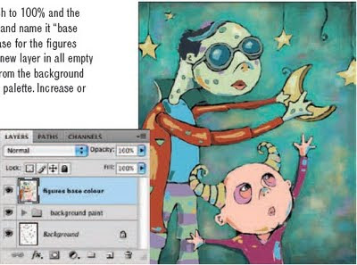
In the Tool Options bar, set the opacity of the brush to 100% and the flow to 50%. Add this brush to the Tool Preset picker and name it “ base color, ” as we’ll be using it to create a flat, colored base for the figures and the stars. Use this brush to add flat color on the new layer in all empty regions of the figures and the stars. Choose colors from the background via the Eyedropper or select them from the Swatches palette. Increase or decrease the size of the brush tip as necessary.
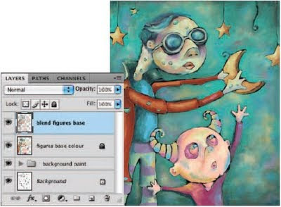
Create a new layer and select the Chalk Blender preset that you created earlier from the Tool Preset picker. As you did earlier with the background, blend the colors beneath this layer together with the Chalk Blender preset on your new layer. Hold down Alt(PC)/Option(Mac) to quickly sample colors from the canvas and then paint with your newly sampled colors in the appropriate areas until sharp areas of color begin to blend together on this layer. Feel free to alter brush size and opacity as required. Also, feel free to add new areas of color on this layer to indicate highlights and shadows.
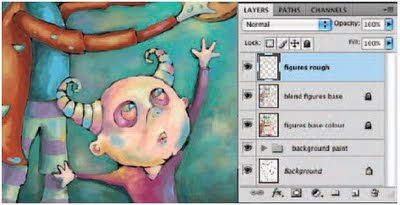
When you are finished adding colors and creating a blending effect on this layer, create a new layer and target it in the Layers palette. Select your Spatter Brush preset from the Tool Preset picker. Now use the spatter brush to paint some light, yet rougher brush strokes over your recently blended areas on the new layer. Use colors sampled from the canvas or from the ever-growing amount of custom swatches in the Swatches palette. Vary the brush size and opacity as needed. You probably want to leave the flow setting fairly low so that the bristles remain pronounced in each stroke.
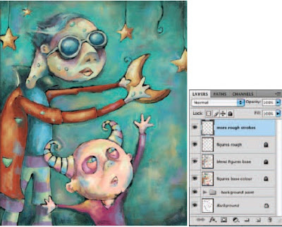
Now use your three custom brushes as well as your dual brush to really add a sense of roughness to the figures and the stars by painting with them on the current layer. Vary size, color, and opacity as needed. Also, if you feel like experimenting, yet are worried about making a mistake on your current layer, go ahead and create another layer to work on. This way, if you like the effect, you can keep the layer. If you don’t like it, you can always delete the layer or even reduce the opacity to lessen the effect.
PART FOUR: Realistic canvas texture
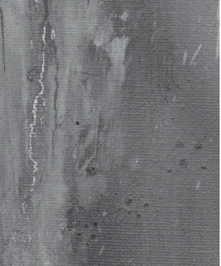
Now, the painting techniques that you’ve used so far are certainly successful in creating a realistic painterly effect. However, when painting digitally, no matter how convincing your brush strokes are, it is the smooth and perfect surface that ruins the authenticity you’ve tried so hard to achieve. In order to remedy this, it is often helpful to involve something genuine. Open up the painting.jpg file. This file is a desktop scan, in grayscale, of section of an oil-painted canvas. We’re going to add this to our painted file to make use of the canvas texture and the cracked paint effect.
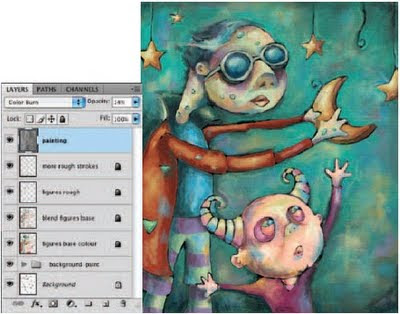
Use the Move tool to click on the painting.jpg canvas and drag it into your working file as a new layer while holding down the Shift key. Holding down the Shift key ensures that it lands in your file in the proper position. Ensure that the new grayscale paint layer is at the top of the Layers palette and change the blending mode of the layer to color burn. Reduce the opacity of the layer to 14%, and you’ll see that a surface texture effect is beginning to take shape as the colors on the underlying layers become darker and more saturated.
Now duplicate your painting layer by dragging it onto the Create a New Layer button
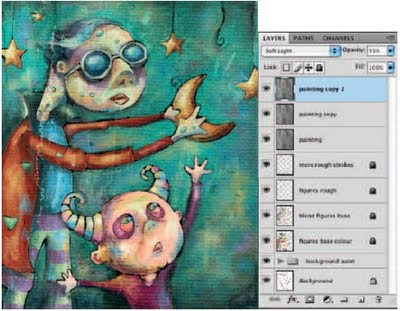
at the bottom of the Layers palette. Change the blending mode of your duplicate layer to vivid light and increase the opacity to 35%. Finally, duplicate your current painting copy layer and then change the blending mode of the recently duplicated layer to soft light to intensify the surface texture effect within the image.
Examining your technique
Now that you’re finished, let’s take a closer look at some of the things that make this the ideal process for painting digitally.
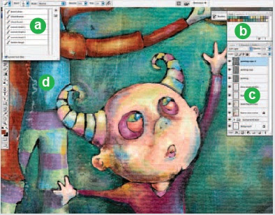
a When you customize your own brushes, and especially when you create your own brush tips from images, saving your tool presets is a very good idea because it ensures that they are always available to you. And saving them as a preset library file ensures that you can access them at any point later on, within this or any other Photoshop file.
b Building up your own custom swatches in the Swatches palette is the digital equivalent of a handheld painter’s palette. Your colors will always be available to you here. Choose the Save Swatches option from the Swatches Palette menu to save them as a file on your hard drive. You can load them or replace an existing set of swatches by choosing either option from the Swatches Palette menu and navigating to your saved file. Swatches can also be saved or loaded in the Preset Manager.
c Keeping different elements and different stages in the process separated on a series of layers allows you enough flexibility to revisit things later and alter them. You can target individual layers and edit or mask their contents. Also, you can insert adjustment layers between layers to affect only certain portions of the composition.
d Using a real-world surface texture is an excellent way to add another level of authenticity to your painting. The simple grayscale scan used here on a series of layers helps to remedy the ultrasmooth digital canvas surface, making it more realistic in the end.
You’ll need a very basic understanding of the Layers palette and Photoshop’s paint tools. You don’t need to know anything about image editing tools or selection tools or anything like that. We are simply discussing the act of painting digitally in a methodical way .
PART ONE: Getting ready to paint

Open up the sketch.jpg file. Starting with a sketch is an essential part of the process when painting in the tactile realm, and working in Photoshop is no exception. The main difference here is that in this case the sketch is scanned rather than being drawn directly onto the canvas. Once you’ve opened up the sketch, select the Brush tool. In the Brushes palette, enable the Smoothing option at the left. We’re going to work with this option enabled for the entire chapter because smoothing guarantees that your brush strokes contain nice, smooth curves. And that is an essential quality when you want your painting to look convincing.

Now, the next thing we’re going to do is establish the Swatches palette as our paint palette and fill it with our own set of colors unique to this painting. By doing this, we can return to the Swatches palette and select one of our custom colors at any point later on. Choose Edit Preset Manager from the menu. Choose Swatches from the Preset Type menu. The Preset Manager can also be accessed via the Swatches Palette menu. If you access it via the Swatches Palette menu, the Preset Type is automatically set to Swatches. When the swatches appear, click on the first swatch and then Shift-click on the last swatch. This will target all of the swatches. When all of the swatches are targeted, click on the Delete button. After they’re all deleted, click on the Done button to exit the Preset Manager, and you’ll notice that the Swatches palette has been emptied.

When the Swatches palette is empty, click on the Foreground Color swatch in the toolbox to access the picker. Select a new foreground color from the picker and click OK. Move the mouse over the empty area of the Swatches palette. You’ll see it temporarily switch to a paint bucket. When you see the paint bucket, click to add the new color to the Swatches palette. Name your new swatch when prompted and then click OK. After naming, the new color is added to the Swatches palette. Use this method to add a variety of colors to the Swatches palette. This method is an excellent way to exercise a little forethought, establishing a predefined color scheme to work within before you begin painting.

After selecting the Brush tool, choose the largest Chalk Brush preset from the Brushes palette. In the Brush Tip Shape section of the Brushes palette, increase the diameter of the brush. You want a large brush here because, first, we want to cover most of the background with color, giving us a new base color other than white. Leave the spacing option enabled but reduce the amount to 1 so that there is no stepping or spaced brush marks present within your strokes. Choose a foreground color from the Swatches palette and click the Create a New Layer button in the Layers palette.
PART TWO:The background and figure outlines

Target your new layer in the Layers palette and begin to paint a series of strokes on the new layer. Focus on areas that are the background, as indicated in the sketch. Just start painting some strokes; don’t cover the line work of the sketch on the underlying layer; and allow a little white to show through between strokes here and there. Also, increase and decrease the brush diameter in the Brushes palette to accommodate different regions on the canvas. For open areas of the background, use a brush of very large diameter; for tighter regions, such as between the small figure’s fingers, use a brush of much smaller diameter.

Choose a different color from either the picker or one of your own custom swatches and paint the background area at the bottom of the canvas. When you’re finished, choose a black foreground color and create a new layer in the Layers palette. Target the new layer and use the brush to begin tracing the black outlines of the underlying sketch on this new layer. Reduce the opacity of your brush in the Tool Options bar to 50% so that there is a translucent effect as you paint small strokes over the top of each other.

Click on the Brush Tip Shape option from the left in the Brushes palette. Use this area often to vary the angle of the brush as you paint. You’ll need to tweak the angle frequently when painting around areas such as the heads of these creatures. If you don’t adjust the angle at times, there will be areas where the strokes appear too thin compared to others. Click on Shape Dynamics in the Brushes palette to enable Shape Dynamics and then on the Angle Jitter Control menu to view the options.

Choose the Direction option from the Control menu, but leave the angle jitter amount set to 0. This setting causes your brush to base the angle of the brush tip on the directions of your stroke as you paint them. Because we still want a somewhat smooth edge to the strokes, the amount is set to 0. The more you increase the amount, the rougher the edges of the strokes will appear. By simply enabling the Shape Dynamic function, you can save yourself the trouble of having to constantly adjust the angle as you paint. Finish painting the black outline.

Reduce the opacity of your brush to 25% and then open the Tool Preset picker at the far left of the Tool Options bar. Click on the Create New Tool Preset button. When you are prompted, name the tool “ Chalk Blender. ” Disable the Include Color option and click OK. This brush is now added to the preset picker, with all of the Brushes palette options and dynamic functions intact. You can access it directly from the preset picker from now on. Create a new layer in the Layers palette and ensure that it is targeted.

Use your current brush, set to 25% opacity, to blend the background fill colors together on the new layer; this is precisely why we named the preset “ Chalk Blender. ” Start by painting strokes over the areas where light and dark colors meet. Paint dark strokes over light areas, and vice versa. Go back and forth painting like this until colors begin to blend together. Change the direction of your brush strokes often as well as the size of your brush tip. Also, if using an opacity of 25% does not give you a blend effect that is as smooth as you’d like, try reducing it when necessary.

Now add different colors from the Swatches palette into the background here and there, using the same brush on the current layer. Try initially adding them using a higher brush opacity setting, and then blending them into the background using lower opacity settings. A quick way to work is to Alt(PC)/Option(Mac)-click on areas of the canvas to sample color rather than always returning to the Swatches palette. This technique is especially useful when blending as you can sample “ in-between ” colors. Using this method, if you happen to sample a foreground color that you like, feel free to add it to the Swatches palette so that you can access it later.

In the Brush presets section of the Brushes palette, select the spatter 59 pixels Brush Tip preset. Now, in the Brush Tip Shape section of the Brushes palette, adjust the angle of the brush tip until you’ve achieved the roughest looking stroke possible. In the Tool Options bar, set the opacity of the brush to 35% and the flow value to 15%. Save this new brush as a tool preset and name it Spatter Rough.

Create a new layer and use your newly created tool preset to paint over areas of the canvas on this layer. Increase or decrease the opacity as required and use colors from the canvas or the Swatches palette. The goal here is to paint with the new brush over areas that look very smooth. Because of the brush tip and very low flow setting, the resulting strokes will add a rougher, more textured feeling to the areas you paint. Using large brush strokes and bold colors will pronounce the rough effect. Use this effect sparingly as it can tend to overpower an illustration.

Open up the brush1.jpg file. Choose Edit Define Brush preset from the menu. Name your brush and return to the working file. Choose your new custom brush tip from the end of the list in the Brush Presets section of the Brushes palette. In the Brush Tip Shape section of the Brushes palette, set the spacing to 1. In the Tool Options bar, set the opacity to 50% and the flow to 15%. Save this brush as a new tool preset. Use this same method to open up brush2.jpg and brush3.jpg and save them as new tool presets, using the same spacing, opacity, and flow settings.

Now that you have added three new custom brushes and a new dual brush to the Tool Preset picker, use them to paint some rough strokes on this layer. Just because the presets contain embedded settings for opacity and flow, that doesn’t mean that you can’t change them each time you use them. Use a variety of colors, brush sizes, opacity, and flow settings to introduce some very real and tactile feeling brush strokes on the current layer. Again, ensure that you do not overdo it as these new brushes, which produce such distinct strokes, can visually overpower the softly blended background quite easily.

When you’re finished, target the top layer and then Shift-click on the layer directly above the background layer in the Layers palette. This will target all of your paint layers. Choose Layer>New>Group From Layers from the menu to add them to a group. Because we’re going to start painting the other image components, this grouping of layers will help us keep things separate and organized. Create a new layer for the base color of the figures. In the Brushes palette, choose one of the default chalk brush tip presets. Ensure that Smoothing is enabled, and in the Brush Tip Shape section of the palette, reduce the spacing amount to 1.
PART THREE: Painting the figures

In the Tool Options bar, set the opacity of the brush to 100% and the flow to 50%. Add this brush to the Tool Preset picker and name it “ base color, ” as we’ll be using it to create a flat, colored base for the figures and the stars. Use this brush to add flat color on the new layer in all empty regions of the figures and the stars. Choose colors from the background via the Eyedropper or select them from the Swatches palette. Increase or decrease the size of the brush tip as necessary.

Create a new layer and select the Chalk Blender preset that you created earlier from the Tool Preset picker. As you did earlier with the background, blend the colors beneath this layer together with the Chalk Blender preset on your new layer. Hold down Alt(PC)/Option(Mac) to quickly sample colors from the canvas and then paint with your newly sampled colors in the appropriate areas until sharp areas of color begin to blend together on this layer. Feel free to alter brush size and opacity as required. Also, feel free to add new areas of color on this layer to indicate highlights and shadows.

When you are finished adding colors and creating a blending effect on this layer, create a new layer and target it in the Layers palette. Select your Spatter Brush preset from the Tool Preset picker. Now use the spatter brush to paint some light, yet rougher brush strokes over your recently blended areas on the new layer. Use colors sampled from the canvas or from the ever-growing amount of custom swatches in the Swatches palette. Vary the brush size and opacity as needed. You probably want to leave the flow setting fairly low so that the bristles remain pronounced in each stroke.

Now use your three custom brushes as well as your dual brush to really add a sense of roughness to the figures and the stars by painting with them on the current layer. Vary size, color, and opacity as needed. Also, if you feel like experimenting, yet are worried about making a mistake on your current layer, go ahead and create another layer to work on. This way, if you like the effect, you can keep the layer. If you don’t like it, you can always delete the layer or even reduce the opacity to lessen the effect.
PART FOUR: Realistic canvas texture

Now, the painting techniques that you’ve used so far are certainly successful in creating a realistic painterly effect. However, when painting digitally, no matter how convincing your brush strokes are, it is the smooth and perfect surface that ruins the authenticity you’ve tried so hard to achieve. In order to remedy this, it is often helpful to involve something genuine. Open up the painting.jpg file. This file is a desktop scan, in grayscale, of section of an oil-painted canvas. We’re going to add this to our painted file to make use of the canvas texture and the cracked paint effect.

Use the Move tool to click on the painting.jpg canvas and drag it into your working file as a new layer while holding down the Shift key. Holding down the Shift key ensures that it lands in your file in the proper position. Ensure that the new grayscale paint layer is at the top of the Layers palette and change the blending mode of the layer to color burn. Reduce the opacity of the layer to 14%, and you’ll see that a surface texture effect is beginning to take shape as the colors on the underlying layers become darker and more saturated.

Now duplicate your painting layer by dragging it onto the Create a New Layer button
at the bottom of the Layers palette. Change the blending mode of your duplicate layer to vivid light and increase the opacity to 35%. Finally, duplicate your current painting copy layer and then change the blending mode of the recently duplicated layer to soft light to intensify the surface texture effect within the image.
Examining your technique
Now that you’re finished, let’s take a closer look at some of the things that make this the ideal process for painting digitally.

a When you customize your own brushes, and especially when you create your own brush tips from images, saving your tool presets is a very good idea because it ensures that they are always available to you. And saving them as a preset library file ensures that you can access them at any point later on, within this or any other Photoshop file.
b Building up your own custom swatches in the Swatches palette is the digital equivalent of a handheld painter’s palette. Your colors will always be available to you here. Choose the Save Swatches option from the Swatches Palette menu to save them as a file on your hard drive. You can load them or replace an existing set of swatches by choosing either option from the Swatches Palette menu and navigating to your saved file. Swatches can also be saved or loaded in the Preset Manager.
c Keeping different elements and different stages in the process separated on a series of layers allows you enough flexibility to revisit things later and alter them. You can target individual layers and edit or mask their contents. Also, you can insert adjustment layers between layers to affect only certain portions of the composition.
d Using a real-world surface texture is an excellent way to add another level of authenticity to your painting. The simple grayscale scan used here on a series of layers helps to remedy the ultrasmooth digital canvas surface, making it more realistic in the end.
+android+porn+app+sex+%5B4%5D.png)


2 komentar:
hai visit here
thank 4 your visit dude, hope you have a nice day
Posting Komentar