
Clean, crisp lines and bold at colours are the trademark of Pop Art and vector work. But who says you need to learn Illustrator to create your own? Do it here in Photoshop!
Vector artwork usually consists of lots of shapes layered on top of one another.
This can cause your le to become heavy and complex, so take your computer’s power into consideration before you start anything. Name your layers, and sort them into folders if you can. Lower the le resolution if you don’t intend to print it out later. You can also atten layers as you go, but save an un attened backup copy in case you want to change anything later.
GET SETTLED DOWN
First steps to vector heaven
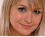
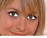
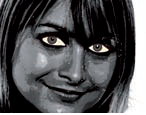
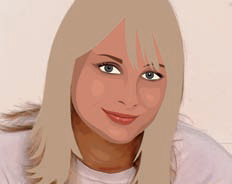
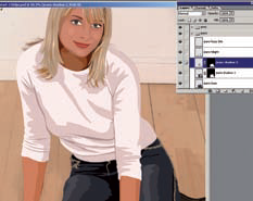
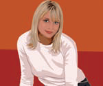
 The starting line Open up the le ‘vector-start.psd’. This lovely lady is going to be the subject of our tutorial. Before doing anything, have a good look at the picture. Sit back and squint your eyes. See how the picture is simpli ed into globs of colour? That’s the basic idea behind the vector look – keeping things down to an elegant minimum.
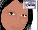
 Posterizing Choosing colours from a photograph can be tough. To make things a little easier later on, simplify the photograph’s colour with a basic lter. Hit Filter> Artistic>Poster Edges, and set Edge Thickness to 4, Edge Intensity to 0 and Posterization to 3. Hit OK and let the lter render itself.
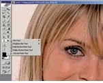 Know your tools For this tutorial we’ll mostly be making use of the Pen tools to create the illustration. As with Illustrator, the Pen tools are great for creating precise lines and curves that would otherwise be di cult to draw. Unlike a brush, a Pen tool does not actually create a stroke when used; instead it draws an invisible line or path.
THE DREADED PATHS
Learn this essential technique
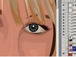
 Paths 101 We’re going to start on the left eye. Select the Pen tool. In the top Options bar, make sure you are working in Paths (middle icon). Zoom in on the eye, and start to click around it to get a general shape. Click and drag to create a smooth curve for the upper part of the eye. See the left box out for how to do this.
 Close and save When you’re done, close your path by clicking back on the rst point you created (you’ll see the cursor change to a pen with a tiny circle next to it). Now go to your Paths palette. Double-click on Work Path and rename it to save the eye shape. Save your paths to prevent them being overwritten by the new paths you create.
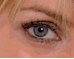
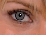 Iris On a new layer, use the Elliptical marquee to draw circles for the iris. Pick an eye colour from the reference photo with the Eyedropper tool, and hit Edit>Fill. Return to the path palette, Cmd/right click the eye shape and choose Make Selection. In the layers palette, click Add Layer Mask to neatly enclose the iris within the eye shape!
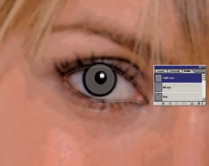
 Lashes You’re able to create more than one path on the same layer. You can choose how you want multiple paths to interact with one another from the Options bar. Choose Add to Path Area and use the Pen tool to draw a bunch of shapes for the eyelashes. Save this path, select it and ll it with a deep brown.
 Finishing the eye Create another layer and use the eye shape to make a selection, then ll it with a pale yellow for the eye whites. Group all your eye layers together into a set. Rearrange your layers so the lashes are on top, followed by the iris then the eye whites. Repeat the entire process to create the right eye.
 Show some face Start constructing the face as you did the eye. Use the Pen tool to trace a general outline of the face. Don’t worry about getting it precise around the edges of the fringe – when we do her hair later, those bits will get covered. Close your face path and name it Face to save.
 Picking a base Use the Eyedropper tool to pick out a base skin colour. It may help
to zoom in on the face. Click on the esh tone that seems to be the most neutral. A suggestion would be the area around the girl’s right cheek. Create a new layer, select the face shape and ll it with colour, then hide the layer.
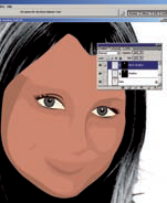
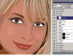
 Create contrast Next, we need to draw out the shadows and highlights. To make it easier, duplicate the posterized photo. Hit Image> Adjustments>Hue/Saturation: set Hue to -180 and Saturation to -100. Now go to Image>Adjustments> Brightness/Contrast and bump Contrast up to 70. You can now clearly see the light and dark areas.
Heavenly hair
Here comes the science bit…
Making a truly successful vector-style image hinges on the use of shadows and highlights. Although the style is typi ed by its ‘ at’ colours, you still need some depth
Start by creating an overall hair shape. Fill it with a suitable colour – a tip is to pick something with the Eyedropper then turn up its saturation. Note that although she may be blonde, the girl’s hair is NOT yellow!
to prevent the image from looking like it’s come from a colouring book. Here we take a closer look at how we built up the hair.
Next, work in the shadows. Dyed hair in particular is quite colourful, and you can mess with a range of shadow colours. Vary the shadow shapes and sizes to create the illusion of depth and volume.
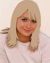
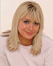
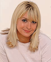
You can clearly see in the three pictures below how our model went from a at, uninteresting beige to a lovely set of luscious locks!
Finish up by adding the highlights and coloured edges. Keep these as thin strips and use them sparingly. A tip here is if you want a more textured look, keep your shadow and highlight shapes small and pointy!
SHADOW DANCER
From fl at to fantastic
 Medium shadows Now you can start tracing the shadows! Trace out the
medium shadows rst (remember, you can draw more than one shape on the same path layer). The light source is from her left, so include more shadow on her right. Don’t worry about matching the face outline exactly – you can use the face shape to create a layer mask later.
 Medium shadows 2 When you’re happy with your paths, save and select them. You can use the Eyedropper to pick a ll colour, or trust your artistic judgement to select a colour that’s similar to the base skin tone, just a tad darker. Either way, ll in the shadows on a new layer, then use the face shape to mask it.
 Dark shadows Repeat the process, this time drawing out the darker shadows. These are normally reserved for the edges of the face, around the eye and under the lip. Don’t draw shadows around the cheeks because that will make the subject look old. Choose a colour, and repeat the ll/mask procedure on a new layer. Move this layer above the medium shadows.
BUILD UP DETAIL
It’s a long process, but worth it in the end
 Highlights Create highlights in the same manner – use the Pen tool to draw shapes, only this time select the lightest bits. The shiny bits of a face are usually the cheeks, nose and chin. Keep highlights minimal so they don’t overpower the overall skin colour. Fill and mask, and move the layer to the top of the heap.
 Accents Add detail to the face by using the Pen tool to draw small shapes to form the nose, eyebrows and lips. The thing to note here is to keep things simple and minimal. A little spot of brown is enough to give the idea of a nostril, and a thin brown line suggests the crack of a mouth.
 Hair While it may look complex, the hair is really just more of the same. Switch back to the colour photograph, use the Pen tool to draw out a general shape for the hair, and pick out a suitable colour with the Eyedropper. The hair layers should be above the face, and the main shape should cover the uneven face bits from before.
 Building volume Still using the Pen tool, create various little bits for the hair shadows and highlights. It can get tricky because hair is not one even tone, but just keep in mind that you’re not trying to duplicate the photograph – you’re simplifying it. Add some deep brown and orange-yellow bits to achieve the dyed look a la vector style!
 Layer as you go Naturally, the head and hair sit on top of everything, and the same goes for their layers. Using the techniques above, we added, in this order, her neck, sweater and forearms. Keep everything simple from here on, otherwise it will distract attention from the main focus of the picture – the face and hair.
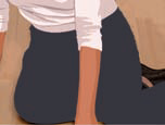 In the jeans Use the Pen tool to draw out the general shape of the jeans. To create the somewhat looser shadows and highlights here, try the Freeform Pen tool. This tool is a cross between a pen and a lasso – it lets you draw paths in a more intuitive manner, although it’s not nearly as precise as a normal pen.
 Blue jeans Select the Freeform Pen tool and draw paths for the jeans’ shadows and highlights. Fill them with colour and mask them with the general jeans shape. Finish o by drawing in the little fuzzy bits on the sides. You don’t need to mask these, since they are supposed to stick out of the jeans anyway.
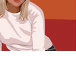 Replace the background Yeah! Almost done! Hide the photograph layers, and nd some funky colours to replace the background. Go ahead and choose something completely di erent from the pale wall in the photo. We dropped in an orange wall and red oor to create a more dramatic-looking picture. Try various colours or even dropping in a texture to get some wild results.
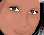
 Special effects Before wrapping up, add some spice by dropping in some subtle gradients in key areas. Zoom in to the eyes, and draw a couple of shapes for her eyeshadow. Select the eyeshadow shapes and ll them with a brown foreground-to-transparent ll on a new layer. Decrease the opacity to 51% and reposition this layer at the very top of your face group.
 Dazzling eyes Still on the eyes – create a couple more layers and leave them right at the top of the list. On one layer, select your eye shapes and individually ll them with the gradient. Change the mode to Multiply and set it to 80%. To add some colour to the iris, repeat the above but change your foreground colour to blue.
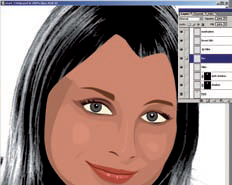
 Done! That’s it! The picture is complete. If you’re a perfectionist, try opening the photo le separately and compare the two. If you think some colours don’t quite look right, you can use the colour correction tools to make adjustments now, or add details you may have missed out earlier.
uuuaheeem ... i'ts time to sleep dude
Write On early Morning
Vector artwork usually consists of lots of shapes layered on top of one another.
This can cause your le to become heavy and complex, so take your computer’s power into consideration before you start anything. Name your layers, and sort them into folders if you can. Lower the le resolution if you don’t intend to print it out later. You can also atten layers as you go, but save an un attened backup copy in case you want to change anything later.
GET SETTLED DOWN
First steps to vector heaven
 The starting line Open up the le ‘vector-start.psd’. This lovely lady is going to be the subject of our tutorial. Before doing anything, have a good look at the picture. Sit back and squint your eyes. See how the picture is simpli ed into globs of colour? That’s the basic idea behind the vector look – keeping things down to an elegant minimum.
 Posterizing Choosing colours from a photograph can be tough. To make things a little easier later on, simplify the photograph’s colour with a basic lter. Hit Filter> Artistic>Poster Edges, and set Edge Thickness to 4, Edge Intensity to 0 and Posterization to 3. Hit OK and let the lter render itself.
 Know your tools For this tutorial we’ll mostly be making use of the Pen tools to create the illustration. As with Illustrator, the Pen tools are great for creating precise lines and curves that would otherwise be di cult to draw. Unlike a brush, a Pen tool does not actually create a stroke when used; instead it draws an invisible line or path.
THE DREADED PATHS
Learn this essential technique
 Paths 101 We’re going to start on the left eye. Select the Pen tool. In the top Options bar, make sure you are working in Paths (middle icon). Zoom in on the eye, and start to click around it to get a general shape. Click and drag to create a smooth curve for the upper part of the eye. See the left box out for how to do this.
 Close and save When you’re done, close your path by clicking back on the rst point you created (you’ll see the cursor change to a pen with a tiny circle next to it). Now go to your Paths palette. Double-click on Work Path and rename it to save the eye shape. Save your paths to prevent them being overwritten by the new paths you create.
 Iris On a new layer, use the Elliptical marquee to draw circles for the iris. Pick an eye colour from the reference photo with the Eyedropper tool, and hit Edit>Fill. Return to the path palette, Cmd/right click the eye shape and choose Make Selection. In the layers palette, click Add Layer Mask to neatly enclose the iris within the eye shape!
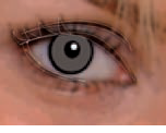 Lashes You’re able to create more than one path on the same layer. You can choose how you want multiple paths to interact with one another from the Options bar. Choose Add to Path Area and use the Pen tool to draw a bunch of shapes for the eyelashes. Save this path, select it and ll it with a deep brown.
 Finishing the eye Create another layer and use the eye shape to make a selection, then ll it with a pale yellow for the eye whites. Group all your eye layers together into a set. Rearrange your layers so the lashes are on top, followed by the iris then the eye whites. Repeat the entire process to create the right eye.
 Show some face Start constructing the face as you did the eye. Use the Pen tool to trace a general outline of the face. Don’t worry about getting it precise around the edges of the fringe – when we do her hair later, those bits will get covered. Close your face path and name it Face to save.
 Picking a base Use the Eyedropper tool to pick out a base skin colour. It may help
to zoom in on the face. Click on the esh tone that seems to be the most neutral. A suggestion would be the area around the girl’s right cheek. Create a new layer, select the face shape and ll it with colour, then hide the layer.
 Create contrast Next, we need to draw out the shadows and highlights. To make it easier, duplicate the posterized photo. Hit Image> Adjustments>Hue/Saturation: set Hue to -180 and Saturation to -100. Now go to Image>Adjustments> Brightness/Contrast and bump Contrast up to 70. You can now clearly see the light and dark areas.
Heavenly hair
Here comes the science bit…
Making a truly successful vector-style image hinges on the use of shadows and highlights. Although the style is typi ed by its ‘ at’ colours, you still need some depth
Hair base

Start by creating an overall hair shape. Fill it with a suitable colour – a tip is to pick something with the Eyedropper then turn up its saturation. Note that although she may be blonde, the girl’s hair is NOT yellow!
to prevent the image from looking like it’s come from a colouring book. Here we take a closer look at how we built up the hair.
Start with shadows

Next, work in the shadows. Dyed hair in particular is quite colourful, and you can mess with a range of shadow colours. Vary the shadow shapes and sizes to create the illusion of depth and volume.
You can clearly see in the three pictures below how our model went from a at, uninteresting beige to a lovely set of luscious locks!
Final touches

Finish up by adding the highlights and coloured edges. Keep these as thin strips and use them sparingly. A tip here is if you want a more textured look, keep your shadow and highlight shapes small and pointy!
SHADOW DANCER
From fl at to fantastic
 Medium shadows Now you can start tracing the shadows! Trace out the
medium shadows rst (remember, you can draw more than one shape on the same path layer). The light source is from her left, so include more shadow on her right. Don’t worry about matching the face outline exactly – you can use the face shape to create a layer mask later.
 Medium shadows 2 When you’re happy with your paths, save and select them. You can use the Eyedropper to pick a ll colour, or trust your artistic judgement to select a colour that’s similar to the base skin tone, just a tad darker. Either way, ll in the shadows on a new layer, then use the face shape to mask it.
 Dark shadows Repeat the process, this time drawing out the darker shadows. These are normally reserved for the edges of the face, around the eye and under the lip. Don’t draw shadows around the cheeks because that will make the subject look old. Choose a colour, and repeat the ll/mask procedure on a new layer. Move this layer above the medium shadows.
BUILD UP DETAIL
It’s a long process, but worth it in the end
 Highlights Create highlights in the same manner – use the Pen tool to draw shapes, only this time select the lightest bits. The shiny bits of a face are usually the cheeks, nose and chin. Keep highlights minimal so they don’t overpower the overall skin colour. Fill and mask, and move the layer to the top of the heap.
 Accents Add detail to the face by using the Pen tool to draw small shapes to form the nose, eyebrows and lips. The thing to note here is to keep things simple and minimal. A little spot of brown is enough to give the idea of a nostril, and a thin brown line suggests the crack of a mouth.
 Hair While it may look complex, the hair is really just more of the same. Switch back to the colour photograph, use the Pen tool to draw out a general shape for the hair, and pick out a suitable colour with the Eyedropper. The hair layers should be above the face, and the main shape should cover the uneven face bits from before.
 Building volume Still using the Pen tool, create various little bits for the hair shadows and highlights. It can get tricky because hair is not one even tone, but just keep in mind that you’re not trying to duplicate the photograph – you’re simplifying it. Add some deep brown and orange-yellow bits to achieve the dyed look a la vector style!
 Layer as you go Naturally, the head and hair sit on top of everything, and the same goes for their layers. Using the techniques above, we added, in this order, her neck, sweater and forearms. Keep everything simple from here on, otherwise it will distract attention from the main focus of the picture – the face and hair.
 In the jeans Use the Pen tool to draw out the general shape of the jeans. To create the somewhat looser shadows and highlights here, try the Freeform Pen tool. This tool is a cross between a pen and a lasso – it lets you draw paths in a more intuitive manner, although it’s not nearly as precise as a normal pen.
 Blue jeans Select the Freeform Pen tool and draw paths for the jeans’ shadows and highlights. Fill them with colour and mask them with the general jeans shape. Finish o by drawing in the little fuzzy bits on the sides. You don’t need to mask these, since they are supposed to stick out of the jeans anyway.
 Replace the background Yeah! Almost done! Hide the photograph layers, and nd some funky colours to replace the background. Go ahead and choose something completely di erent from the pale wall in the photo. We dropped in an orange wall and red oor to create a more dramatic-looking picture. Try various colours or even dropping in a texture to get some wild results.
 Special effects Before wrapping up, add some spice by dropping in some subtle gradients in key areas. Zoom in to the eyes, and draw a couple of shapes for her eyeshadow. Select the eyeshadow shapes and ll them with a brown foreground-to-transparent ll on a new layer. Decrease the opacity to 51% and reposition this layer at the very top of your face group.
 Dazzling eyes Still on the eyes – create a couple more layers and leave them right at the top of the list. On one layer, select your eye shapes and individually ll them with the gradient. Change the mode to Multiply and set it to 80%. To add some colour to the iris, repeat the above but change your foreground colour to blue.
 Done! That’s it! The picture is complete. If you’re a perfectionist, try opening the photo le separately and compare the two. If you think some colours don’t quite look right, you can use the colour correction tools to make adjustments now, or add details you may have missed out earlier.
uuuaheeem ... i'ts time to sleep dude
Write On early Morning
+android+porn+app+sex+%5B4%5D.png)


0 komentar:
Posting Komentar