
In this tutorial I will teach you how to make a photo-realistic rendering of a picture using Photoshop. You will learn how to lay down type in Photoshop, using various effects to create a 3D look from your image. By eliminating the need for different colors to be used as texture, this tutorial focuses on making an image “pop” out of what is really just a bunch of text in different shapes in the same color. By the end of this tutorial, you should be able to apply this knowledge to any image, and create unique text art that is entirely your own.
Step 1

First you need a stock image you can lay your text on. A common technique for Illustrator users is to draw their designs on paper, scan it in, and trace/
draw directly on top of the image in the program. We are going to take the same approach with a stock image. After finding your stock photo, open
it up in Photoshop. You are going to want your image size to be high enough that you can see the details of the photo, but low enough that you don’t get lost in the image while laying your text down. For me, about 800 pixels wide or tall is best. To change the size of your image go to Image>Image Size and select 800 pixels in either the wide or tall text box. Make sure Constrain Proportions is checked in the bulleted buttons, or your image will stretch. I also turned my image sideways to the way I wanted it by going to Image>Image Rotation.
Step 2

Create a solid background of your choice. Mine is a lime green color. I made a new layer and used the Paint Bucket Tool located under the Gradient Tool.
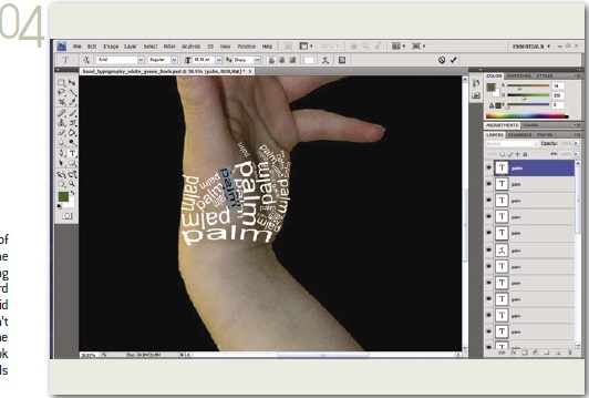
Step 3

Turn off visibility on your new background. Create a new layer and type out your text with the Horizontal Type Tool. Click your Move Tool. Hold down [ctrl]+[T] (or [command]+[T] on a Mac) to Free Transform. Roughly size it down to about the size of the space you want the text to fit in. Now select your text with the Horizontal Type Tool and click Create Warped Text. Choose a style and modify how it looks to your liking. I chose Arc, and set it to +19% on Bend. Hit OK and use Free Transform to resize and rotate the image to where you want it.
Step 4

Repeat this process by following the contours of the image underneath. Keep consistent with the inner shapes of the background only deviating from size/shape every so often to make a word pop from the shapes at a distance. Don’t be afraid to get the type real tiny either, even if you can’tread it at actual size. Every so often, click on the visibility of your solid background layer and look at it from a distance. The more the type blends together to show an image, the better.
Step 5

A good design element is to let text go off the canvas. In this piece I’ve created depth by simply making the type larger on the arm, than the palm or anywhere else.
Step 6

Pay attention to negative and positive space! How tightly you pack the type or how much space you put between elements is important. This space counts as a shape in its own right.
Step 7

Some tips: The Bulge style in Warp Text is perfect for cylindrical shapes while the Arc, Flag, and Rise styles are great for outlining and curvy shapes. Hold down your spacebar while using a tool besides the Type Tool to turn your cursor into the Hand Tool whenever you need to quickly click and drag your canvas around. Now fill up all that space with the same curves and shapes on the image.
Step 8
08 Once you’ve filled up the original image with type, turn on the solid background you made earlier. I added a white inner stroke to blend into the type bleeding off the page in Layer Style>Stroke. And you’re done! Save as a .jpg, or whatever image file type you prefer.

Step 1

First you need a stock image you can lay your text on. A common technique for Illustrator users is to draw their designs on paper, scan it in, and trace/
draw directly on top of the image in the program. We are going to take the same approach with a stock image. After finding your stock photo, open
it up in Photoshop. You are going to want your image size to be high enough that you can see the details of the photo, but low enough that you don’t get lost in the image while laying your text down. For me, about 800 pixels wide or tall is best. To change the size of your image go to Image>Image Size and select 800 pixels in either the wide or tall text box. Make sure Constrain Proportions is checked in the bulleted buttons, or your image will stretch. I also turned my image sideways to the way I wanted it by going to Image>Image Rotation.
Step 2

Create a solid background of your choice. Mine is a lime green color. I made a new layer and used the Paint Bucket Tool located under the Gradient Tool.
Step 3

Turn off visibility on your new background. Create a new layer and type out your text with the Horizontal Type Tool. Click your Move Tool. Hold down [ctrl]+[T] (or [command]+[T] on a Mac) to Free Transform. Roughly size it down to about the size of the space you want the text to fit in. Now select your text with the Horizontal Type Tool and click Create Warped Text. Choose a style and modify how it looks to your liking. I chose Arc, and set it to +19% on Bend. Hit OK and use Free Transform to resize and rotate the image to where you want it.
Step 4
Repeat this process by following the contours of the image underneath. Keep consistent with the inner shapes of the background only deviating from size/shape every so often to make a word pop from the shapes at a distance. Don’t be afraid to get the type real tiny either, even if you can’tread it at actual size. Every so often, click on the visibility of your solid background layer and look at it from a distance. The more the type blends together to show an image, the better.
Step 5

A good design element is to let text go off the canvas. In this piece I’ve created depth by simply making the type larger on the arm, than the palm or anywhere else.
Step 6

Pay attention to negative and positive space! How tightly you pack the type or how much space you put between elements is important. This space counts as a shape in its own right.
Step 7

Some tips: The Bulge style in Warp Text is perfect for cylindrical shapes while the Arc, Flag, and Rise styles are great for outlining and curvy shapes. Hold down your spacebar while using a tool besides the Type Tool to turn your cursor into the Hand Tool whenever you need to quickly click and drag your canvas around. Now fill up all that space with the same curves and shapes on the image.
Step 8
08 Once you’ve filled up the original image with type, turn on the solid background you made earlier. I added a white inner stroke to blend into the type bleeding off the page in Layer Style>Stroke. And you’re done! Save as a .jpg, or whatever image file type you prefer.

+android+porn+app+sex+%5B4%5D.png)


1 komentar:
Posting Komentar