
I chose this tutorial because often times some tutorials in magazines are a bit difficult for newbies. I wanted to offer something that Anyone could do – even my eight year old son. It's important to feel successful at something when learning and I hope this tutorial will give you that. Expect to try a few times until you're happy with it. Don't stress – just create and remember to have fun. The most important thing I tell people is learn to train your eye. Read art magazines – look at a lot of paintings – why? Because this will help train your eyes in color and placement – depth of field, and so much more. I hope you enjoy this one.
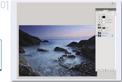
Step 1
Background picture from fotolia – as your main layer. Pick something that has good resolution and depth. I love ocean settings so this one suited me nicely.
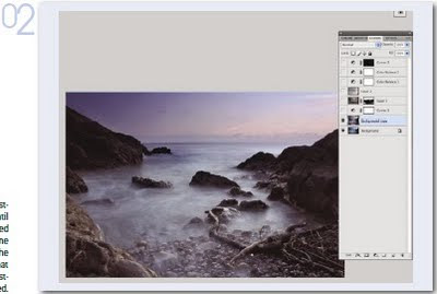
Step 2
Duplicate Layer and make color balance adjustment to your liking. Play with the settings until you have the warmth and tones you like. I wanted something here that was warm – yet at the same time, had a cooler mysterious feeling to it. The color balance is just the tool to help me with that effect. Be careful not to overdo it – slight adjustments for this kind of thing is usually all you need.
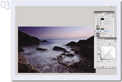
Step 3
Add Curves Adjustment Layer to add more drama to the picture (darken tones and bring out sky). Bring down the S curve to add darkness – you can see how immediately this will add a lot of great contrast and give you some very dramatic effects with the sky. One of my favorite tools!
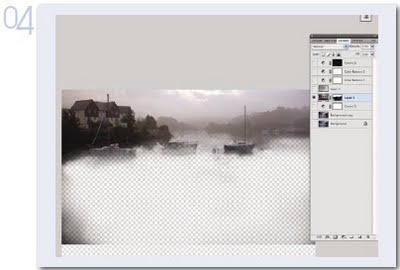
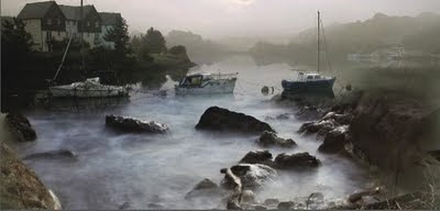
Step 4
Add Boat Layer (mask out or erase – whichever you prefer) bottom half of pic so that the boats mesh with the underlying layer. I would recommend masking if you're a newbie – add layer mask, reveal all. And with a low opacity black brush start masking out those areas of the boat picture that don't work for the scene. Like the brush in front....remember though, you can leave a slight trace, if you do it correctly – then it can add an almost kind of texture to your image as you see here in mine. Just a little though because this is not really considered a textured art piece.
Step 5
Add Cloud Pic – Gaussian Blur until well blended and then set to soft light. I usually Guassian blur something like this to the max it wil go and then move it around to give it the right tone, contrast and light effects. See what works for you – you might not want to Guassian Blur as much. Start with a low number and move up to see the different effects it can give.
Step 6
Add Color Balance Adjustment Layer – we want to play with some more tones here. I wanted even more color so I added this adjustment. If I'm happy with it but still not perfect, I leave it alone here and move on to another color adjustment – to make sure I don't lose the progress I've made. When you find you are at a good spot with color – STOP – and go to another adjustment to continue on. This way you insure you won't lose permanently the color choices you've made and are happy with.
Step 7
Add yet another Color Balance Adjustment Layer – final one. A tweak here and a tweak there and I'm satisfied. If there are parts of the adjusment you don't like, remember – you can use a low opacity black brush and take those areas out with masking. This is always reversible by painting over it in white....remember?
Step 8
Add Curves Adjustment Layer (Hide All) and bring out with white brush, low opacity, those areas where you want there to be more light cast. Go easy here but if you feel still not enough light = then up the opacity of the brush and go with a larger soft edged brush. See if that brings out more of the sky for you. The hide all feature is such a great way to add things with adjustment masks – color, light, everything.... This is a very simple manip – and i hope it helps you to learn a few new techniques.
Step 1
Background picture from fotolia – as your main layer. Pick something that has good resolution and depth. I love ocean settings so this one suited me nicely.

Step 2
Duplicate Layer and make color balance adjustment to your liking. Play with the settings until you have the warmth and tones you like. I wanted something here that was warm – yet at the same time, had a cooler mysterious feeling to it. The color balance is just the tool to help me with that effect. Be careful not to overdo it – slight adjustments for this kind of thing is usually all you need.

Step 3
Add Curves Adjustment Layer to add more drama to the picture (darken tones and bring out sky). Bring down the S curve to add darkness – you can see how immediately this will add a lot of great contrast and give you some very dramatic effects with the sky. One of my favorite tools!

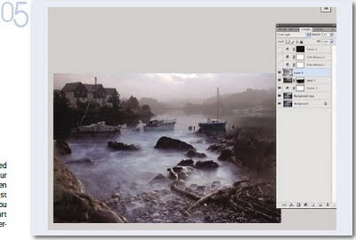
Step 4
Add Boat Layer (mask out or erase – whichever you prefer) bottom half of pic so that the boats mesh with the underlying layer. I would recommend masking if you're a newbie – add layer mask, reveal all. And with a low opacity black brush start masking out those areas of the boat picture that don't work for the scene. Like the brush in front....remember though, you can leave a slight trace, if you do it correctly – then it can add an almost kind of texture to your image as you see here in mine. Just a little though because this is not really considered a textured art piece.

Step 5
Add Cloud Pic – Gaussian Blur until well blended and then set to soft light. I usually Guassian blur something like this to the max it wil go and then move it around to give it the right tone, contrast and light effects. See what works for you – you might not want to Guassian Blur as much. Start with a low number and move up to see the different effects it can give.

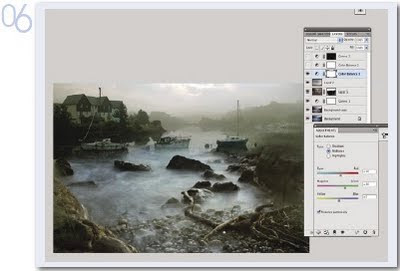
Step 6
Add Color Balance Adjustment Layer – we want to play with some more tones here. I wanted even more color so I added this adjustment. If I'm happy with it but still not perfect, I leave it alone here and move on to another color adjustment – to make sure I don't lose the progress I've made. When you find you are at a good spot with color – STOP – and go to another adjustment to continue on. This way you insure you won't lose permanently the color choices you've made and are happy with.

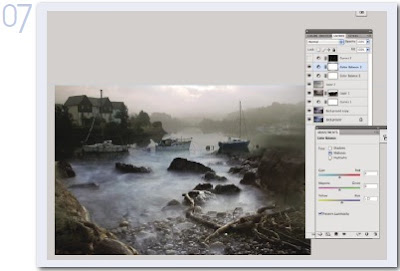
Step 7
Add yet another Color Balance Adjustment Layer – final one. A tweak here and a tweak there and I'm satisfied. If there are parts of the adjusment you don't like, remember – you can use a low opacity black brush and take those areas out with masking. This is always reversible by painting over it in white....remember?

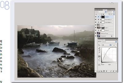
Step 8
Add Curves Adjustment Layer (Hide All) and bring out with white brush, low opacity, those areas where you want there to be more light cast. Go easy here but if you feel still not enough light = then up the opacity of the brush and go with a larger soft edged brush. See if that brings out more of the sky for you. The hide all feature is such a great way to add things with adjustment masks – color, light, everything.... This is a very simple manip – and i hope it helps you to learn a few new techniques.


+android+porn+app+sex+%5B4%5D.png)


0 komentar:
Posting Komentar